
Hello! I'm Oanh.
I am a Product Designer with a special interest in designing for accessibility! I use my previous experience as a teacher to extend compassion to colleagues, clients, and users.I am currently searching to join and collaborate with a dynamic team where I can contiue to learn and apply my skills. Based in Michigan, and open to relocation :)
Projects

How HabitShare increased their average user star rating from 2.9 to 3.8

About
When I'm not designing, you can find me cuddling with my cat, perfecting my yoga poses, video gaming, exploring oil pastels or watercolor paints, or strength training.


Contact
Let's collaborate! I am always eager to meet new people and create something special.

HabitShare app revamp
Conceptual redesign to enhance the social experience of habit-tracking with friends
My Role
User research
UX design
Interaction design
Length of Study
4 months
Design Method
Double diamond
Research Method
Secondary research
Heuristic analysis
HabitShare was established in 2018 to help users track habits with their friends, allowing accountability between users.
User Problem
Users find a lack of social features to hold friends accountable when tracking habits
Business Problems
Increase user satisfaction ratings
Increase user engagement
Project Goals
Improve social features
Redesign the UI and add dark mode
Discover & Define
User Research
User and Business Problems
Competitive Analysis
User Journey Map
User Research: Summary
I conducted secondary research using customer feedback, as well as a competitive analysis to identify how HabitShare's competitors meet their users’ needs in relation to their design problems.During my research, I found that users were struggling to effectively engage with their friends. Because it is a social habit tracking app, users were craving more group features, such as creating collaborative habits where they can track together and engage with each other, having a group chat, or engaging with their friends' completed habits.
Collecting Customer Feedback
In the below figure, I took user reviews from Google Play’s store and categorized them by type, which allowed me to identify pain points and the severity of each.
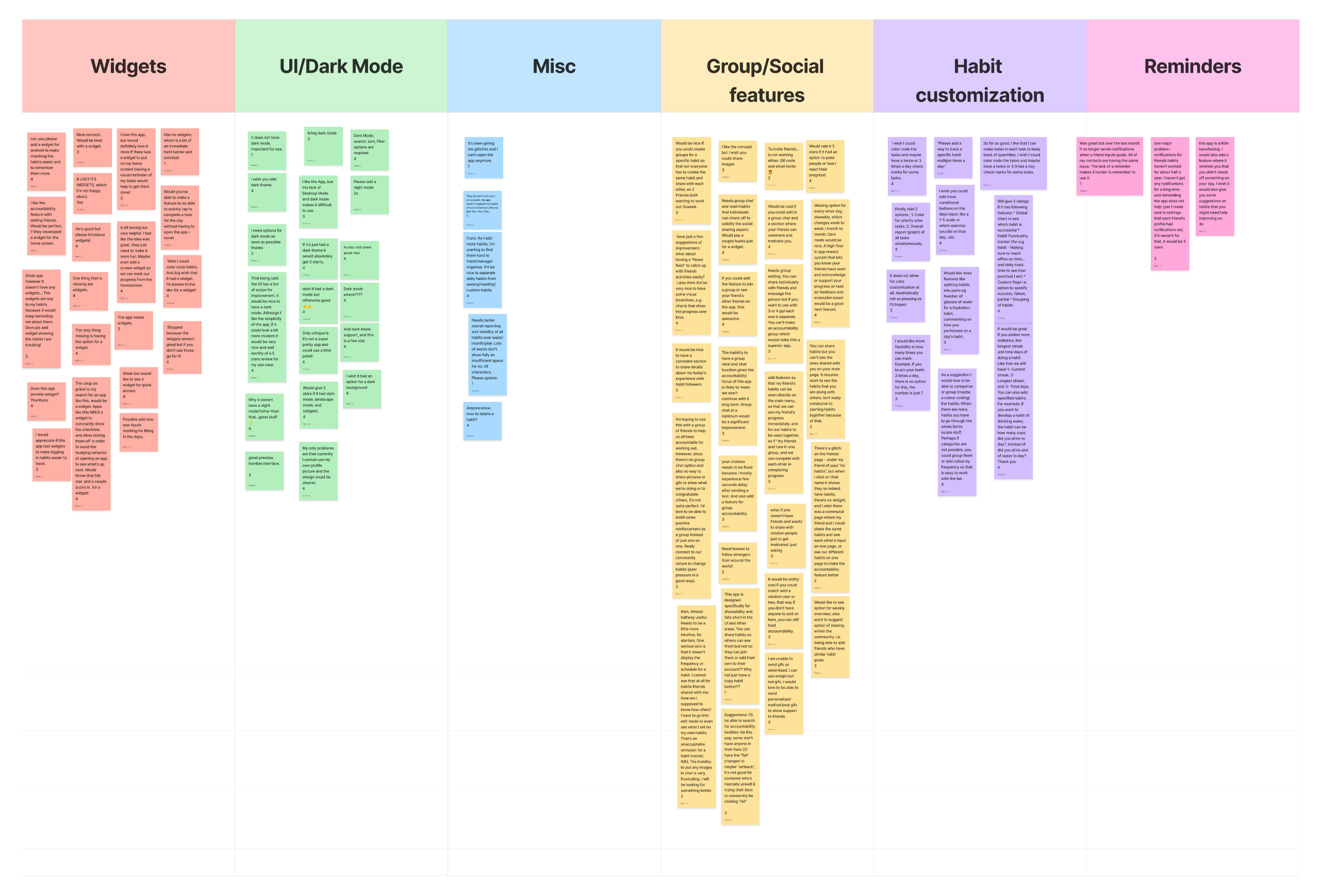
User Research: Pain Points
During my research, I uncovered two main pain points:
Lack of Social Features
Users found there are a lack of social features to effectively engage with their friends, e.g. group chat, building habits with friends and not just sharing.
No Dark Mode
Users also found that the outdated UI and the lack of dark mode is unappealing and makes the product difficult to use.
Competitive Analysis
To identify how our competitors met their users’ needs in relation to HabitShare's main design problem, I conducted a competitive analysis between two habit-tracking apps: Habit Tracker and Routinery.

Problem Statements
Lack of Social Features
Many users want to engage with their friends in a meaningful way.However, this is a problem because there are very few social features, even though the app markets itself as a social app.A lack of social features could lead to customer dissatisfaction and low retention rates.
No Dark Mode
Users may use the app at the end of their day, which is a problem because there's no dark mode, meaning it can cause eye strain and usability at nighttime.If there's no dark mode for nighttime users, it could lead to a decrease in app usage for the business.
User Journey Map
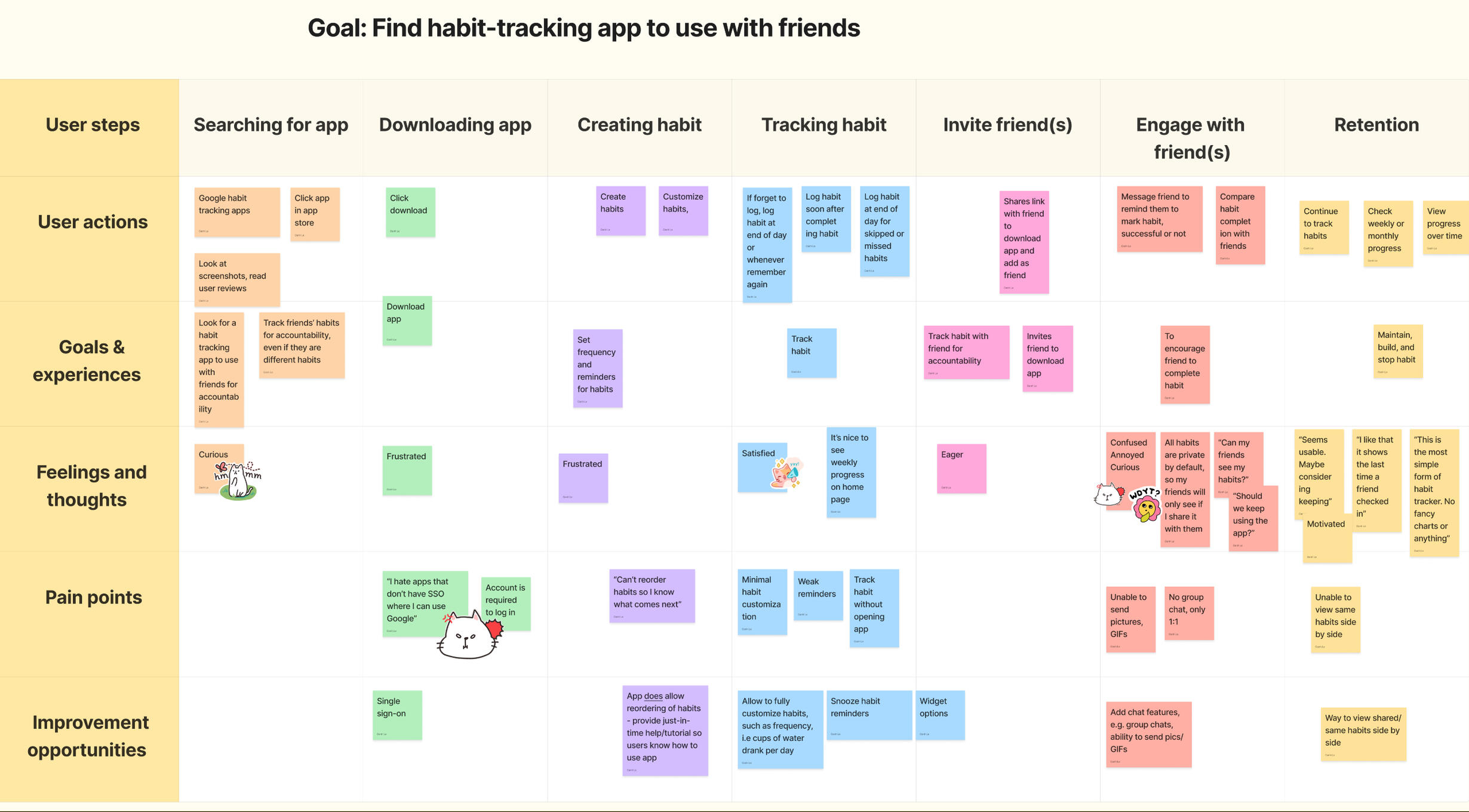
Develop & Deliver
Paper/Digital Wireframes
Low/Hi-fidelity Prototypes
Mockups
Accessibility Considerations
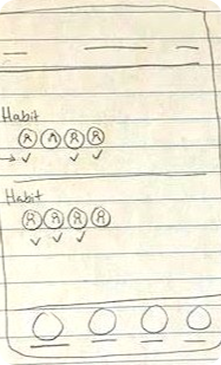
Paper Wireframes
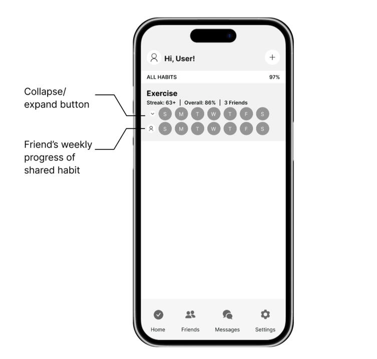
Many users were happy with the weekly tracking display, so instead of changing that layout, I wanted to add to it. My goal for the first design was to show that users could view shared habits side-by-side with friends and compare each other’s progress that way.
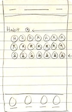
Digital Wireframes
To visualize the first idea on a mobile device, I created a digital wireframe.Additionally, I moved the "archives" button into the settings page, and incorporated an "add" button for users to add new habits.
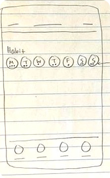
Low-fidelity Prototype of Idea 1

During the first user test, I gave 3 participants a task scenario:You and your friend just downloaded a habit-tracking app to keep each other accountable for your habits. You both have a shared habit of exercising. Find out how your friend is doing this week for that habit.While I observed the users carry out this task, I noticed that they would select the Friends page. Because of this, I decided to move the side-by-side view to the Friends page, as shown in the next prototype figure.
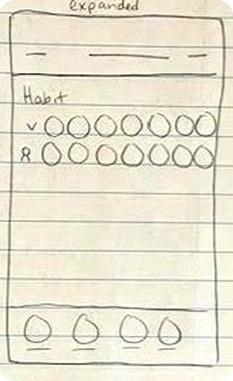
Low-fidelity Prototype of Idea 2

After the first user test, I moved the side-by-side view to the Friends page since participants intuitively selected this option for the task scenario. Also, users liked the simplicity of this layout, so I kept the personal habits on the home page from the original design.
Mockup
Before

I made the Friends page engaging where users can compare their habits side-by-side with friends. To view/add to their friends list, users can select the icon on the top right.
After Usability Test

High-fidelity Prototype
Accessibility Considerations
Color Dependency
I made the app more accessible for users with color blindness by ensuring that color wasn't the only visual means of conveying information.
VoiceOver
For users with limited vision, I audited the app for VoiceOver and unfortunately, completing a task is not possible with screen readers. This would be an important feature to consider for future improvements.
Going Forward
Takeaways
Next Steps
Takeaways
ImpactsTo measure the impact of my designs, I can look at the customer satisfaction score. If we take the reviews that are 4 stars or less who desired dark mode or more social features, we can assume that the customer satisfaction score will increase by at least 1 star.For example, 17 users gave a rating of 4 stars or less because there was no dark mode, which resulted in an average star rating of 3.4. If we launched a dark mode feature, user ratings may increase by at least 1 star, which may result in an average star rating of 4.4.
What I Learned- Conduct as much research as possible, before starting the design process- Test your designs as often as possible before proceeding with higher-fidelity designs and prototypes
Next Steps
After completing usability testing with new social features, I would look into other features that current users are needing in order to complete their goals quicker.For example, there weren’t many users who brought up widgets, but if the feature were introduced, many users would likely find this usable as it allows the users to complete their goals without opening the app, thus tracking their habits with as little clicks as possible.